Swatcher Homepage Redesign
Playing around with the Swatcher homepage to simplify things and entice people to explore.
It seems I’m changing things every day on Swatcher. I’m terrible for tinkering, but it’s a project I’m having great fun with.
I’m happy with the main app area, which feels like a pretty typical app style. You have a sidebar and content.
The homepage is something I struggle a bit more with, and originally it was far more complicated. I was listing all the details I could to get across all the functionality it offers. It got to a point where I wanted to step back. Rather than overload someone with information, I decided to simplify it, and bake some actual features that people can use onto the page.
Here’s what you were first greeted with before:

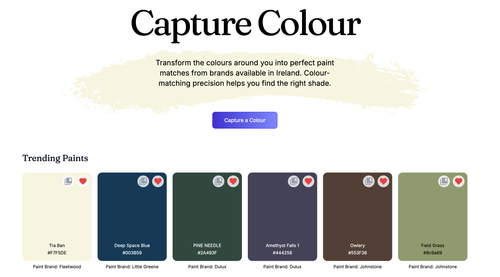
So now we have something far simpler, but also a bit more inviting. I hope. You can see a live view of trending paint colours, and dive into paint exploration by picking a colour right on the homepage.
Come back next week when it changes again. I’m feeling better about this approach, though, so it might hang around a while longer.