The Web Should Be Simple
I don’t know if you do the same, but sometimes I like to disable JavaScript for a website to have a look and see how dependent it is on it.
This started when I began learning more about accessibility, and it helped me recognise certain do’s and don’ts. I want to build something that doesn’t rely heavily on JS. That’s not to say I want to avoid it altogether; I love writing apps with Vue, for example, but we’re constantly reinventing behaviours that come with the browser, and we can let things slip through the gaps if we’re unaware of the tradeoffs and fallbacks.
For a more blatant experience, I decided to install Lynx, which is a text browser (brew install lynx on macOS).
My work is not perfect, but how many sites fall apart here is pretty shocking.
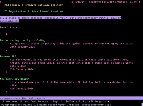
Take, for example, a site like my own. It’s basic. You have links and text. Some JavaScript is involved, but it doesn’t obstruct access to content (unless that content is an interactive demo). Here’s how it looks using Lynx:

You can navigate between pages because links are links, and the requested HTML has the content the link describes.
Yet, when applied to other sites (huge ones, sometimes), it’s like staring into the void. The site collapses into itself, barely offering up a shrug. Buttons aren’t links, so you can’t go where you need to go. Where you expect to find a list of articles, you see nothing because they are fetched on the fly.
We’re doing more work to create a poorer experience and write non-sensical code, and to top it all off, we’re teaching others that this is the way to do it. That’s my little rant.