Personal Website & Blog
A modern, fast, and accessible personal website built with Eleventy, featuring custom CSS architecture and performance optimizations.
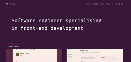
This is my personal website and blog where I share thoughts on web development, showcase projects, and document my learning journey. The site is built with a focus on performance, accessibility, and maintainability.
# Key Features
# Performance First
The site is built with performance in mind, featuring:
- Static site generation with Eleventy
- Minimal JavaScript footprint
- Optimized images with multiple formats (WebP, AVIF)
- CSS that’s minified and inlined for critical rendering path
- Lazy loading for non-critical assets
# Accessibility & UX
- Semantic HTML structure
- ARIA labels and proper heading hierarchy
- High contrast colour scheme
- Keyboard navigation support
- Screen reader friendly content
# Content Management
- Markdown-based content authoring
- Automated social media image generation
- RSS feed for blog posts
- Tag-based content organization
# Technical Architecture
The site uses a modular CSS architecture based on ITCSS (Inverted Triangle CSS) principles:
- Settings: Global configuration and design tokens
- Tools: Mixins and functions (minimal, CSS-only approach)
- Generic: Reset and normalize styles
- Elements: Basic HTML element styling
- Objects: Layout-related classes
- Components: UI components like buttons, cards, navigation
- Utilities: Helper classes for spacing, visibility, etc.
# Build Process
The build process is streamlined and efficient:
- Content Processing: Markdown files are processed with custom filters
- Asset Optimization: Images are automatically resized and converted to modern formats
- CSS Processing: Modular CSS is concatenated and minified
- JavaScript Bundling: ES6+ modules are processed for browser compatibility
- Deployment: Automatic deployment to Netlify on git push
# Design Philosophy
The design emphasizes:
- Simplicity: Clean, minimal interface that doesn’t distract from content
- Typography: Thoughtful type hierarchy with web fonts optimized for performance
- Responsive Design: Mobile-first approach that works beautifully across all devices
# Continuous Improvement
This project serves as a testing ground for new web technologies and best practices.
The codebase is regularly updated to incorporate new web standards and optimization techniques, making it both a professional showcase and a learning platform.