Improving Client-Side Performance
Below are some ways I’ve found to optimise the performance of a site when getting it ready for a production environment, or patching an existing site. Where possible I’ll list some common implementations, though understandably we don’t always have the kind of access we want to make changes.
These opportunities for client-side improvements are typically more common among websites rather than web apps. I think this is because of the tooling that comes with modern web app development e.g., vue-cli handles code-splitting, and generates a service worker. With build tools like webpack, or Gulp, it also means you can install a plugin to slot somewhere in the process that takes care of some of these. Others need some TLC, and a sympathetic ear.
# Images
A picture paints a thousand words, but that’s no good when many of those words are synonyms for “slow”. People aren’t always aware of the specifics of an image, nor should they have to be in some cases. If it’s possible to upload a 5mb image, then chances are it’ll happen at some point. That’s just how it goes.
There are some methods we can use to automate the reduction of overall bloat, and still preserve image quality. Where automation isn’t always available (for things like static sites, or non-CMS based projects) there’s still plenty of tools we can employ.
# Resize
The first port of call is to resize the image. Generally speaking, we don’t need a higher-than-usual-res image for something that only takes up a portion of the page, or isn’t the reason for the page existing. If photography is your gig, then you can serve a smaller image with an option to view the high-res version if they so wish.
If you do a search for “resize image” you’ll find a whole host of online solutions that will do the job for you. This is great if you’re only concerned with one or two images at any given time, but what if you have a folder full of them?
# Batch Resize on MacOS
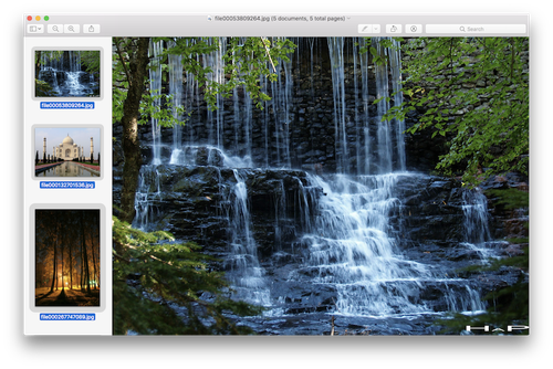
MacOS comes with a program called Preview which lets you batch resize images. To do this, select all your images, right click and open with Preview.
From here you’ll see the preview window:

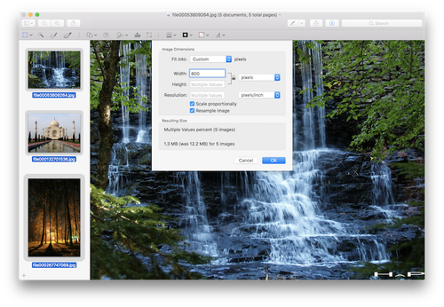
Pressing CMD + A, you can select all the images, then go to Tools > Adjust Size. The dialogue that appears will let you set a value for the width and height, though you might only set the width and let it scale the image for you so no part of the picture is clipped.

# Batch Resize on Windows
It’s been a while since I’ve worked on a Windows machine, so pardon my ignorance here.
One solution I’ve seen is to send your images as a mail attachment, at which point you’ll be presented with an option to resize them and preserve their aspect ratio.
Another, possibly more ideal, option is some software called ImageResizer. When you select a group of images, and right click, it adds an option to resize from the context menu that appears.
# CMS
WordPress comes with baked-in support for resizing images. If you’re using Timber for WordPress (give it go, it’s class) then you can also resize images on the fly.
If you’re using Craft CMS, you can resize, set the quality, and change the format of an image within your control panel and templates.
For ExpressionEngine, a ridiculously powerful plugin is CE Image. If you’re working on a big project, then the asking price is worth it. Otherwise, there are some resize capabilities in the control panel.
# Cloud
This approach, depending on your needs, could be a great way to manage images. If you’re ok with storing your images with another service (provided you have your own copies backed up somewhere), then the free tier of Cloudinary will be quite appealing. Once you upload an image, you can manipulate the URL to make modifications such as resizing or converting to another format.
# Optimise
If you haven’t already gone the cloud or CMS route, then we still need to optimise things further.
Once the images have been resized to your liking, the next step involves analysing them to identify any cruft that can be removed to reduce the file size. Some approaches include:
- Removing metadata that might have been attached from the camera that took the original picture
- Optimising JPEGs to reduce the number of colours required to render the picture
- Converting from PNG to a lossy format if transparency isn’t required
Long before software existed, we would have had to parlay with an image, and barter for pixels. We would have lengthy discussions trying to convince it that it looked just as good with 80 shades of red rather than 200. Or that JPEG suited it better than PNG. It was sparse times for all involved.
Luckily, there are tools available to make this quick and simple. We’re happy, and the images are happy.
# Reduce File Size
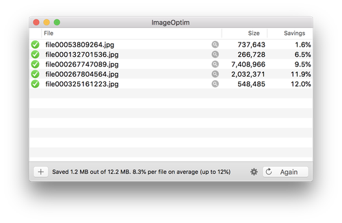
ImageOptim is my favourite for optimising images. You drag your images onto the program and it does the rest, replacing the existing ones by default. It lets you know how much it’s saved as well. If you’re not happy, you can update the preferences for more aggressive optimisation.

The ImageOptim website has a page that suggests alternatives for other platforms. Again, apologies for my MacOS-centric state of mind.
# Convert PNG to JPEG
If your images don’t need transparency, you can convert them to JPEG and reap the benefits of a smaller file size.
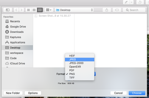
On MacOS you can open your images in Preview, as before, then after selecting everything you can go to File > Export Selected Items. In the dialogue that appears, in the bottom left is a button labelled Options. From here you can select a different format.

There’s also plenty of online tools that do this. On Windows, an option might be some software like IrfanView which I believe lets you batch convert images. I don’t know if I’ve said this yet Windows users, but I’m sorry. I haven’t even apologised to Linux users yet.
# Responsive
Making your images responsive involves more than:
img {
  max-width: 100%;
  height: auto;
}
Sure, it resizes, but you could be wasting a lot of bandwidth here. If I need a sticky note I don’t fold an A4 sheet into a small square; that would be a waste of paper.
If we follow the approaches above, we can combine different sized images and serve the appropriate one to the user.
To do this, we can either use the <picture> element, or the srcset attribute. With <picture> you’re giving instructions to the browser to render a specific image at a given breakpoint. With srcset you’re giving information to the browser, and trust it to deliver the most appropriate image in any given case. The two can be used together as well for greater control.
Using <picture> is great for cases like art direction, when on a smaller screen the image might be too small to make sense of, so you want to serve a different image, or a cropped version of the original, to preserve the original meaning.
An example from the Responsive Image Community Group website:
<picture>
  <source media="(min-width: 40em)"
    srcset="big.jpg 1x, big-hd.jpg 2x">
  <source
    srcset="small.jpg 1x, small-hd.jpg 2x">
  <img src="fallback.jpg" alt="">
</picture>
The srcset attribute means you have less control over what the user ends up seeing, so it’s a good idea to keep this reserved for resized images. It could be dependent on the size of their screen, or even their network capabilities.
And another example from the Responsive Image Community Group website:
<img src="small.jpg"
     srcset="large.jpg 1024w, medium.jpg 640w, small.jpg 320w"
     sizes="(min-width: 36em) 33.3vw, 100vw"
     alt="A rad wolf">
For more information I’d recommend checking out the… Responsive Images Community Group website, as they cover usage and use cases in greater detail. Smashing Magazine also has a good overview of it.
# Lazy Loading
So you have your images resized and optimised with your responsive image tags in place. What else could we possibly do? Well, it’s not guaranteed a user will see every image on the page, so why make them download everything? Take for example a carousel. Now, I know people have opinions, and I’m gonna stay clear of that. You do you. But how often does someone see every slide of a carousel? We could instead load the image when the new slide arrives.
The same goes for scrolling, not everyone makes it to the bottom of a page for one reason or another.
By far my favourite solution is LazyLoad.
<img class="lazy" alt="..."  data-src="../img/44721746JJ_15_a.jpg">
<noscript>
  <!-- If JavaScript isn't available -->
  <img alt="..." src="../img/44721746JJ_15_a.jpg">
</noscript>
var myLazyLoad = new LazyLoad({
elements_selector: ".lazy"
});This works for the srcset attribute in <picture> and <img> as well.
# Third-Party Plugins/Scripts
You’d be surprised how many external scripts are loaded on some websites for various tasks. Some are unavoidable, such as analytics, but others aren’t strictly necessary for the functionality that they provide.
# Sharing Widgets
This is a common one, where someone wants there to be buttons available to share a page on any social media platform they want, then and there. You don’t need an external service firing JavaScript into your site to do that, though.
You can make it works with HTML, and either use the supplied CSS, or use your own to blend it in with the rest of the site. For this, you can use Sharingbuttons.io, or Simple Sharing Buttons. Both offer a clean approach, while the latter also has a JavaScript version which will automatically gather the relevant page information to share. If you’re using a content management system, you should get by without it by populating the sharing URLs with information on the current page.
# Social Media Feeds
OK, this one is a bit more involved… you can include social media feeds without JavaScript, but you need to have some sort of server-side access to render them. You can roll your own using a given social media’s SDK, or use a plugin. The added bonus of this is being able to style it to match your site.
I don’t have any recommendations on this part, as I ended up rolling my own for Craft CMS, ExpressionEngine, and WordPress for work projects. I used the PHP SDKs for Twitter and Instagram. So that can be a fun learning experience.
It’s more straight-forward with WordPress, as you can create a PHP file and include it in your functions.php file. For Twitter, I used the twitter-api-php package for gathering the latest tweets of an account.
I’m sure there are solutions out there for your CMS of choice, however, and I’ll leave it to you to find one that does the job. This isn’t an easy-out, I just don’t have experience with those plugins. Hopefully, it’s sparked some investigation on ways you can speed up your projects.
# Bundling Assets
If you’re not using webpack, Gulp, Parcel etc… for packaging all of your dependencies, then you may see extra requests happening in your browser. In my experience, this happens mostly with WordPress sites where plugins drop their own styles and scripts into your templates.
WordPress users rejoice, you can choose from many solutions such as Autoptimize, and W3 Total Cache which brings more than just combining assets to the table.
I’m not aware of up to date plugin solutions for other platforms, but I’ll add them here if I come across any.
If you’re using npm, a quick solution might be to use the UglifyJS package. So after running npm install uglify-js, you can add a new script to your package.json:
"scripts": {
  "build": "uglifyjs src/vendor/jquery.js src/main.js -o dist/bundle.min.js -c -m"
}
The command npm run build then would combine and minify your JavaScript. The -c, and -m flags will compress and mangle your code.
# Service Workers
Using service workers, we can intercept network requests and serve up cached assets. What we can do is, once the user has visited the site, cache things like styles, scripts, fonts etc… then any subsequent requests from that user will be served from the cache. Once we make updates, we can invalidate the service worker, and fresh assets will be downloaded again.
For this site at the moment, I’m using the SW Precache webpack plugin. This lets me generate a service worker with webpack when I move things into production. I’m finding it’s especially useful for fonts to avoid a flash of unstyled text.
Here’s the configuration from my site:
new SWPrecacheWebpackPlugin({
  cacheId: 'tj-ie-v3',
  filename: 'service-worker.js',
  minify: true,
  stripPrefix: 'static',
  staticFileGlobs: [
    'static/fonts/*.woff2',
    'static/fonts/*.woff',
    'static/js/main.js',
    'static/css/main.css',
    'static/js/chunks/*.js',
  ]
})
This greatly improves performance, though if you make some drastic changes a user might see a broken site until they reload. Maybe there’s a solution for that, but I haven’t gotten that far yet in my service worker career.
Google has an introduction that’s worth looking at, if you want to dig deeper and understand how it fully works (like I didn’t).
# Bonus Research
While writing this I became aware of Progressive Tooling which looks to be a pretty fine resource for tooling around this subject.
If you want to eek out more performance improvements, have a look at these:
- link rel=“preload” lets you identify priority assets to improve loading performance
- Cloudflare makes use of a global CDN to improve performance. It has a generous free offering as well, which makes it worth trying out.
That’s all I have! I’ll update this with any new insights I receive, but hopefully there are a few bits here that prove useful.